The Right Frame for Your Artwork
Now, this is a little more tricky one to advise on. All I can provide here are some recommendations on how to frame your new artwork, but eventually I believe this is mostly a matter of personal taste, your taste!
That said, it is important to know that the frame of an artwork can make a big difference in how the artwork is perceived by viewers. It can enhance or diminish the characteristics of the piece and thus have a significant impact on the overall appearance of the work.
The first thing you might want to try is to see if the artist who created the work has his own preference; ask back if you’re in doubt. If he or she does, see if the suggested frame would fit into your home or office and – very important – also makes good company with your existing artwork.
There are dozens of different frame styles and they differ in material, shape and colour. There are minimalist frames with straight edges and without any decorative elements and there are baroque-style frames which are pieces of art in and of themselves.
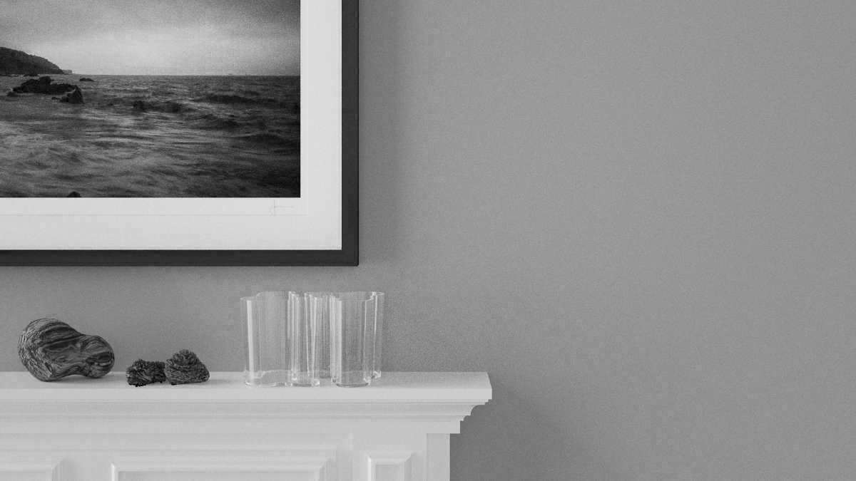
Personally I think that for most contemporary artwork a more minimalist frame can often be the best choice because the frame doesn’t provide any eye-catching details that may distract from the artwork. I also consider a simple minimalist frame the basis of all frames. Although providing the form and functionality of a frame, it remains subtle in the background and guides the viewer’s attention to the artwork.
Because the frame is in fact an integral part of the artwork and its selection was a fundamental part of the creation process, following the artist’s recommendation ensures your artwork keeps its original characteristics and conveys the intended emotion. Ask if the artwork represents any particular emotions? What’s the artwork’s history and had this history affected the choice of frame during the creation process?
Besides the Artist’s Preference there Are a Few Key Points to Consider:
- The style of the artwork
What are the key characteristics of the artwork? Colour, technique, particular genre and/or art period? - How will the composition of the piece harmonise with the frame?
Is the frame too heavy for the artwork, would it overwhelm it or is it too ‘light’, does it look flimsy? - What’s your personal preference?
If you look at your existing collection of artwork (if you have any, of course), what frames did you choose in the past? Were these deliberate and conscious choices or were they chosen by the artist? If you chose them, do they represent your own taste?
Not Only Shape and Material Add to the Story, the Colour of a Frame is of Course Affecting its Presence and Impact:
- Choose a frame colour complementary to the predominant colour in your artwork. This ensures the frame doesn’t distract from the art as it may be difficult for the eye to determine what to look at. However, as with all rules and recommendations in this guide, use this one with care. If a strong frame colour enhances the artwork and emphasises its characteristics, then sure thing go for it!
- Make the frame mood match the artwork’s mood. For artwork with predominantly warm colours, choose a frame with a warmer tint and vice versa. Again, as contradictory as I may sound here, some artwork may benefit from the opposite, a cooler frame colour in combination with a warmer artwork and vice versa.
For black and white artwork you will likely have to try both lighter and darker frame variations as they may be affecting the artwork very differently. - If you’re in doubt about the colour or if you’re overwhelmed by the range of available options, consider picking a natural wood frame. This evergreen comes in various degrees of lightness and even with only a basic touch of wood oil it looks fabulous with almost any artwork!
I am well aware that this can be a difficult thing to figure out. However, don’t let this abundance of choice overwhelm you. If you’re not happy with the frame suggested by the artist or if the artwork is available only without frame, then speak to a picture framer in your area. These specialists advise you based on their expertise and some have computer applications that simulate different frames and mattings with your artwork.
Mat or no Mat
A mat, also known as matte board, mat board or passepartout (French), is a thin, often paper-like board placed between the artwork and the protective glass sheet. Its primary purpose is a) to prevent the artwork from touching the glass and b) to guide the viewer’s eye towards the artwork. The former is a protective measure, the latter an aesthetic aspect of the framing process.
The more unique (and expensive) a piece of artwork is, the more important it is to use a mat board. Mat boards for protective purposes have a thickness of approx. 1/16th of an inch, any matting above 1/16in only serves decorative purposes.
With a mat board in place, your artwork is protected from a variety of physical damages, most of them caused by a change of the humidity level in the air. While dry air doesn’t harm the artwork, humid air does and significant variation in humidity levels have an even stronger damaging impact. High levels of humidity can lead to mildew, mould and dissolving/smearing pigments/inks used in the artwork. More than that, some artwork tends to stick to the protective glass sheet over time. Once this happens, reframing the artwork is no more an option.
So to decide whether you should use a mat board, ask yourself the following questions:
Would a mat board accentuate the artwork?
If so, note that matting is another component that plays together with the artwork and the framing. Different frames go best with certain mat boards and both matting and frame should – as a team – emphasise the artwork, not detract from it.
Is the mat board likely to give an extra layer of protection to the artwork (it will almost always do)?
If you add a mat (which I strongly recommend), consider the balance between frame and mat board, the individual width of both in relation to each other that is. In my opinion, there is no right or wrong here. You can go with what you feel looks right, just keep it balanced. In terms of numbers, we’re talking about a few inches.
A mat for a medium-sized image can be anything from one to three inches per side whereas large artwork may require mats up to 4 inches in width. Some artists/art buyers prefer the mat to be of different width at the bottom side of the frame. This can make framed artwork look more balanced and pleasing to look at.
Note that any extra inch of matting on other than all four sides of the artwork equally may require bespoke framing as such deviation from the original aspect ratio will inevitably render standard aspect ratio frames unsuitable. This is important if you planned to buy a frame for a standard aspect ratio artwork.
Framing Art Is an Art in and of Itself!
Remember: framing adds a significant visual touch to a piece of art. Some art may go better with certain frame styles and less so with others. Some of my still life work, for example, wouldn’t lend itself to a baroque style frame but it looks great in a minimalist gallery frame.
Choosing a frame can be difficult and often it is a balance between preference and works well with the artwork in question. It is important to choose a frame that doesn’t compete with the artwork and detract from it because it draws too much attention. It may look great, but it will inevitably distract from the artwork and diminish its appearance.
No Frame Is Set Forever
Many artists know that some buyers prefer to acquire new artwork without frames so they can get it framed to their personal taste by a dedicated picture framer of their choice. These artists create and offer their artwork in ‘standard’ sizes with common aspect ratios such as 2:3, 3:4 or 1:1 (square), allowing their customers to buy the artwork they love from the artist and purchase a frame of their choice somewhere else.
Artists of different genres may go different ways here, however. Photographers, for example, often follow this approach more naturally as their cameras innately dictate a particular aspect ratio right from the beginning of the creative process. Painters, printmakers or Illustrators on the other hand may be less conscious about these default sizes and their aspect ratios, or they simply work with what their local art supply can provide. Also, artists of the object-oriented arts (i.e. sculpting, painting, screen-printing) often offer their work in a higher price range than creators in the non-object oriented arts (photography, multimedia art, etc.), so any additional costs for bespoke framing may be consciously neglected.
The Advantage of Standard Sizes
Purchasing artwork in a ‘standard size’ and a common aspect ratio will always allow you to change the frame of your artwork at any time with little trouble and at a reasonable expense. Most picture framers can reframe your artwork into any different frame of your choice, be it a frame from their own stock or any frame you provide.
Most of my artwork falls into one of the two standard aspect ratios of 2:3 and 3:4. Both ratios are the default aspect ratios of current digital cameras and although I am not limited to these ratios and I often divert from them, I like to provide default sizes to my customers because of the ease in matting and framing.
See also:
Choose The Right Size For Your Artwork
How to Hang New Artwork